Vignette mgx2r - time serie
Marion Louveaux
2018-10-19
Source:vignettes/vignette_time_series.Rmd
vignette_time_series.RmdThe goal of this vignette is to highlight the power of R and Plotly regarding the visualisation of time series.
Data (all meshes from one individual)
Some .ply demonstration data coming from my PhD thesis are attached to this package and used here in the vignette. This dataset is a timelapse recording of the development of a WT shoot apical meristem expressing a membrane marker. I took one 3D stack every 12h and have 5 timepoints in total. Here I load the .ply and cell graph .ply for all the timepoints of this timelapse recording.
ply.dir <- system.file("extdata", "full/normalMesh/", package = "mgx2r")

mesh.all <- map(list.files(ply.dir, recursive = TRUE, full.names = TRUE),
                ~ read_mgxPly(file = .x, ShowSpecimen = FALSE))


graph.dir <- system.file("extdata", "full/cellGraph/", package = "mgx2r")

cellGraph.all <- map(list.files(graph.dir, recursive = TRUE, full.names = TRUE), ~read_mgxCellGraph(fileCellGraph = .x, header_max = 30))
Plotly with slider
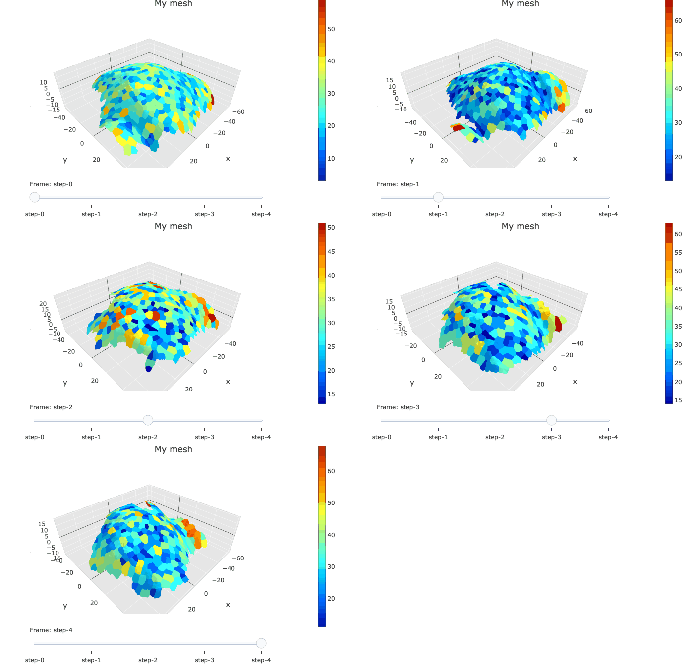
In plotly, the slider option allows to visualise several graphs linked by a time variable.
meshColors.all <- list(NULL, NULL, NULL, NULL, NULL)

plotlyMesh_all(meshExample = mesh.all,
                       graphExample = cellGraph.all,
                       meshColors = meshColors.all,
                       display = 'heatmap')